Context
I'm a product designer. A mum. A wife. I carry every task in my head until it slips through my fingers.
Renew insurance. Book the dentist. Call my friend back. They're not emergencies. They don't have deadlines. They just live in your head forever - until they don't.
I use Todoist, Trello, Jira - they're great. But they treat a task due tomorrow the same as one due in 3 months. Just another card, another row. For household tasks that live somewhere between "urgent" and "someday," that flat structure creates pressure where there shouldn't be any yet.
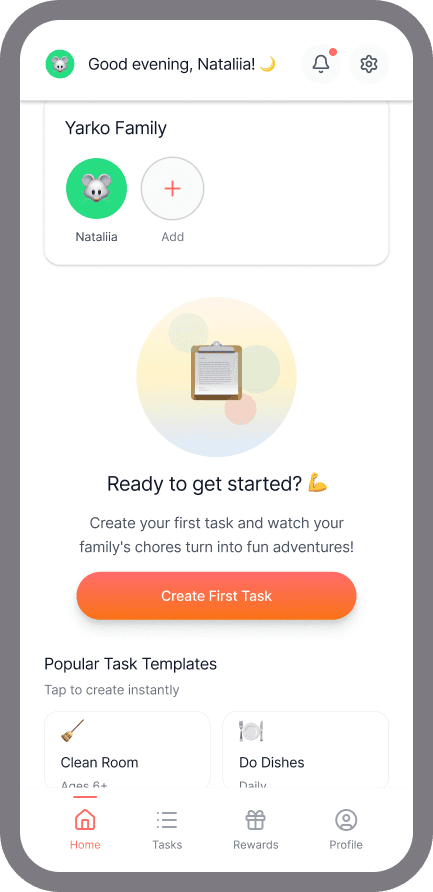
I didn't want to replace those tools - I wanted a different lens. Something where a task 3 months away stays small and calm, and only grows when it actually needs your attention. That's why Chores Bubbles has a Kanban view too. The bubble view isn't better. It's just lighter.
I wanted something that didn't feel like nagging - for me or my teenager. So I spent 3 days building it.

Research
The problem with existing solutions
Lists, cards, and calendars carry the same psychological weight as a work project. They imply deadlines, ownership, accountability - the exact kind of pressure that makes people avoid opening the app.
Before touching any tool, I talked to friends who were in the same room with the same problem - tasks that weren't urgent enough to schedule but too important to forget. Everyone recognised it instantly. Nobody had found an app that handled it well. That was enough validation to start building..
The insight: the problem isn't that people forget tasks. It's that the tools to manage them feel like more work than the tasks themselves
"I wanted something that didn't feel like nagging - for me or my teenager. So I spent 3 days building it."
Insights
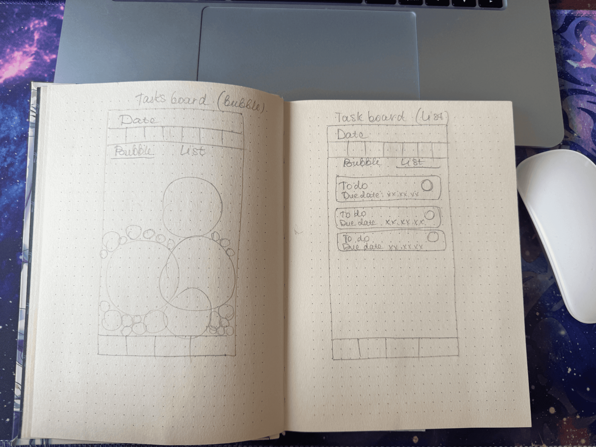
The design decision: why bubbles
Day 1 was entirely ideation - no screens, just thinking and conversation with Claude about what the mental model should be.
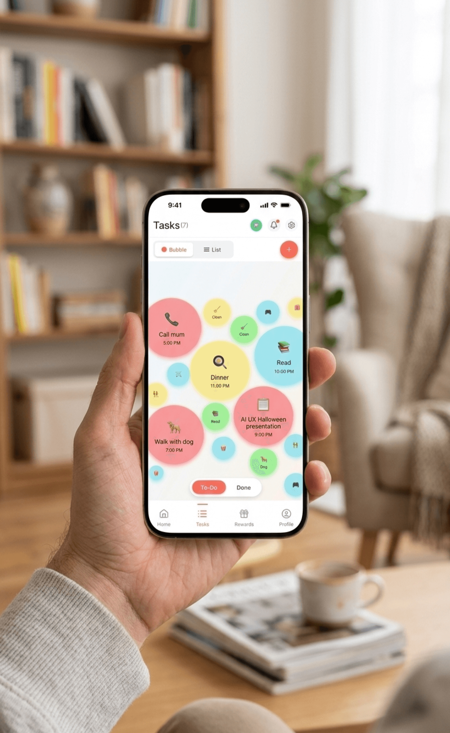
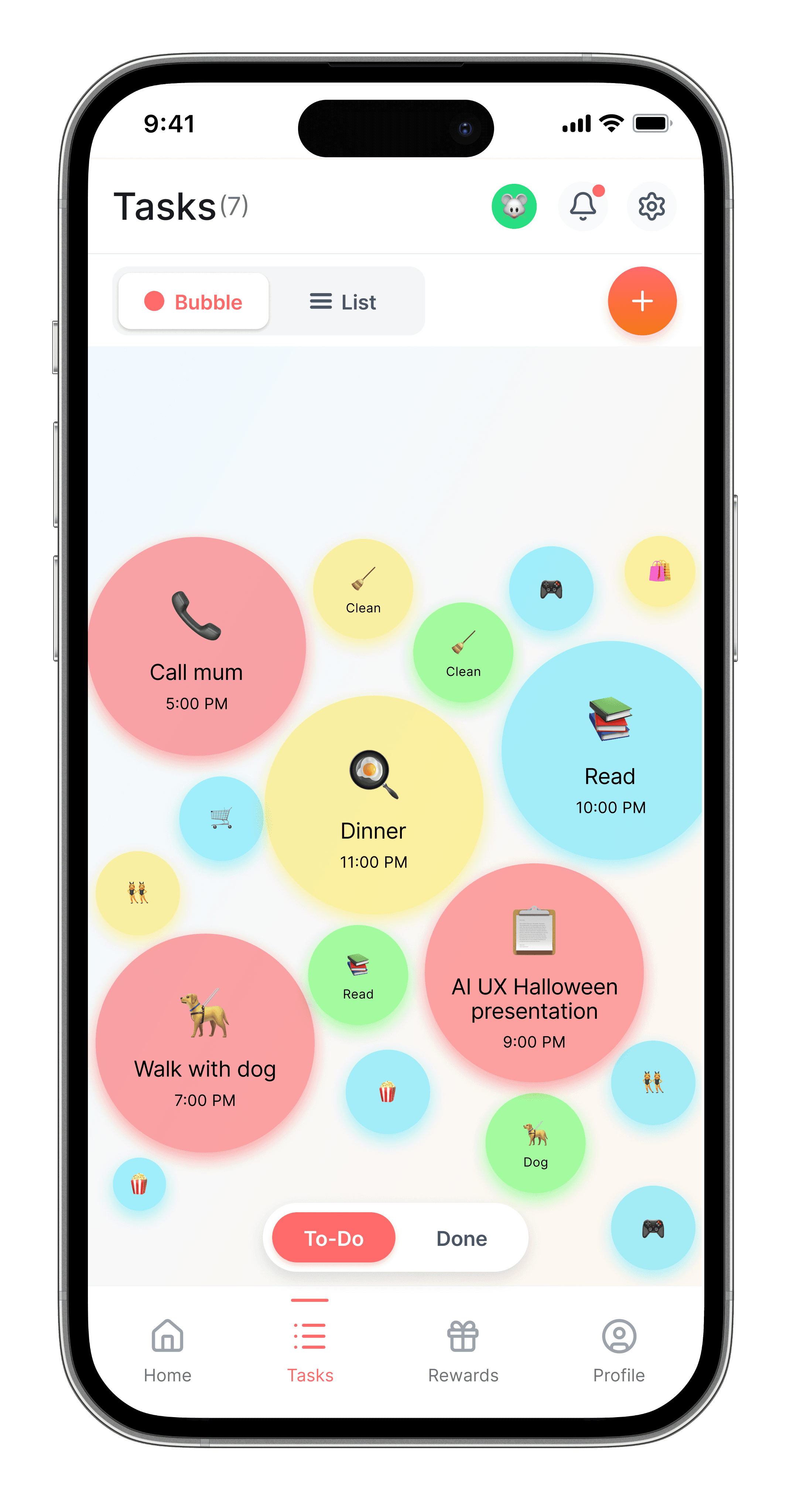
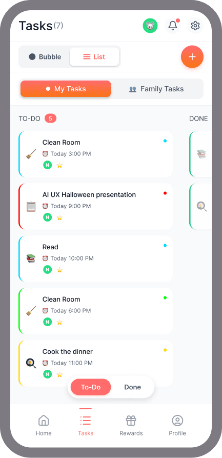
Tasks shouldn't feel urgent until they actually are. A list treats everything equally. A bubble system treats things proportionally - small and unobtrusive when there's time, impossible to ignore when there isn't.
Size = urgency. The closer to the deadline, the bigger the bubble grows. Colour = priority. Red for can't miss, green for whenever.
Everything visible at once. Your whole mental load. Organic, floating, not overwhelming - just real.
Ideation
Mapping the logic before touching Figma
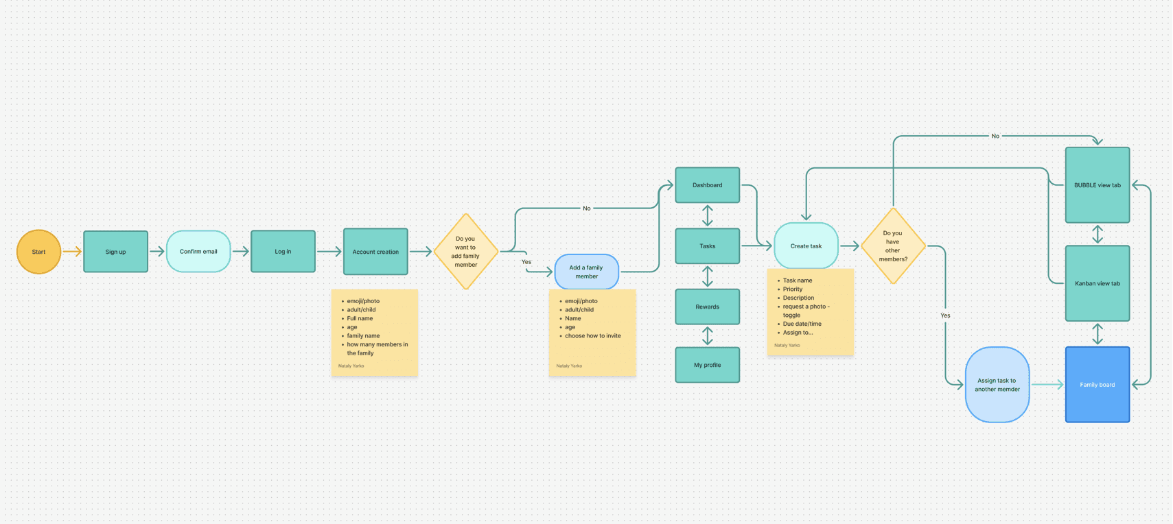
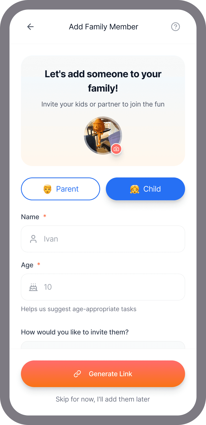
Before touching Figma, I mapped the full user flow with decision points and data requirements. Two questions shaped the entire architecture: whether you're setting up alone or as a family, and whether a task belongs to you or someone else. Those two branches determined every screen that followed - including the two view modes, bubble and Kanban, that emerged naturally from the logic rather than being designed in advance.
Design
How I built it - with AI, not just using it
Day 2: Flow and logic. I didn't open Figma. I spent the whole day talking through the flow with Claude - user roles (parent vs child), the task creation flow, the approval loop, the rewards system. We argued about features. We cut things. We refined.
Day 3: Figma Make. Claude wrote the vibe code. Figma Make turned it into a working prototype. I tested it with my husband, a friend, and my mentor from the AI UX workshop.
The secret was treating Claude like a teammate, not a generator. I didn't just prompt and paste. I pushed back, asked why, changed my mind, and made Claude change its too.
Paper first, Claude and Figma Make second
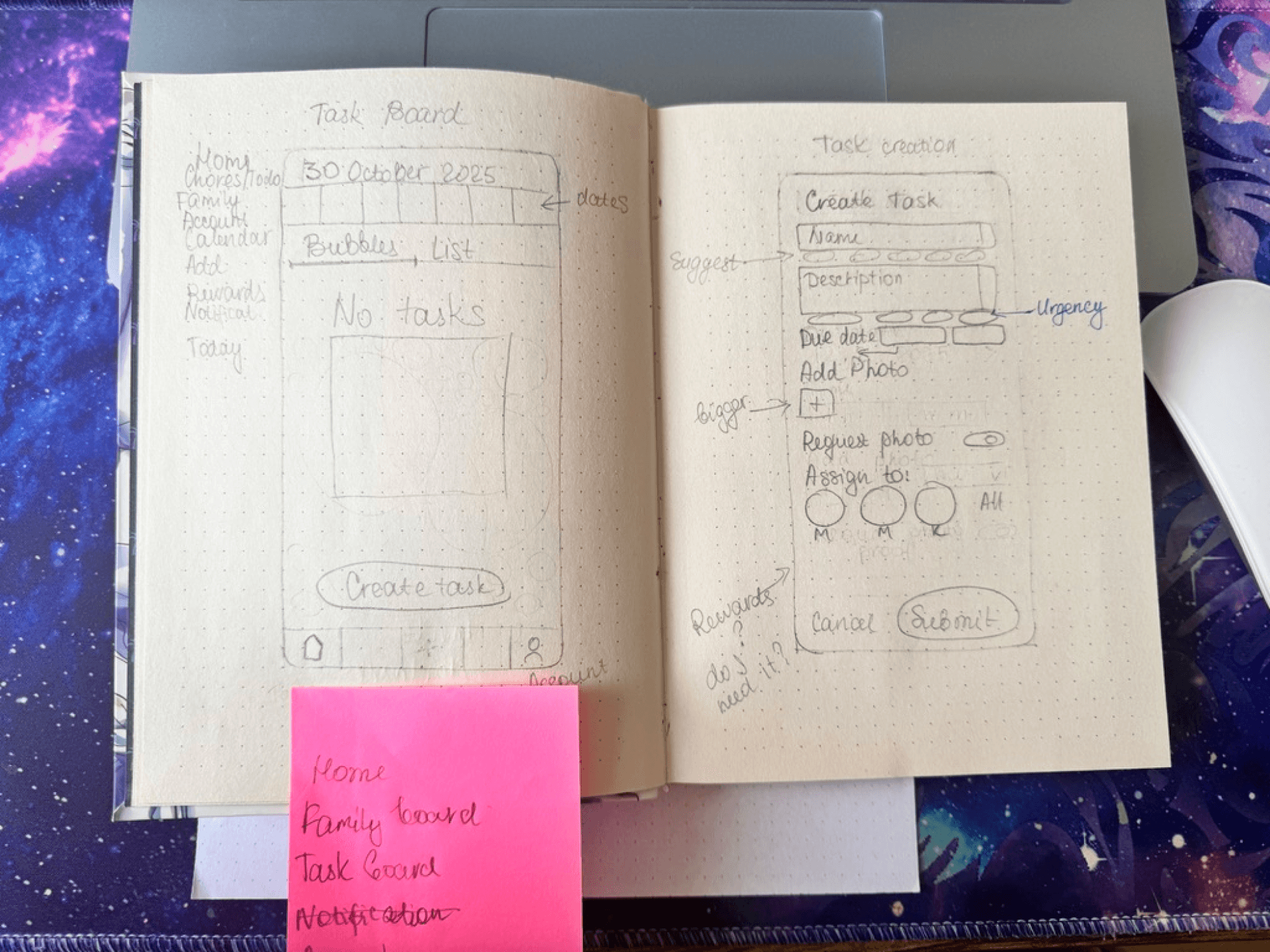
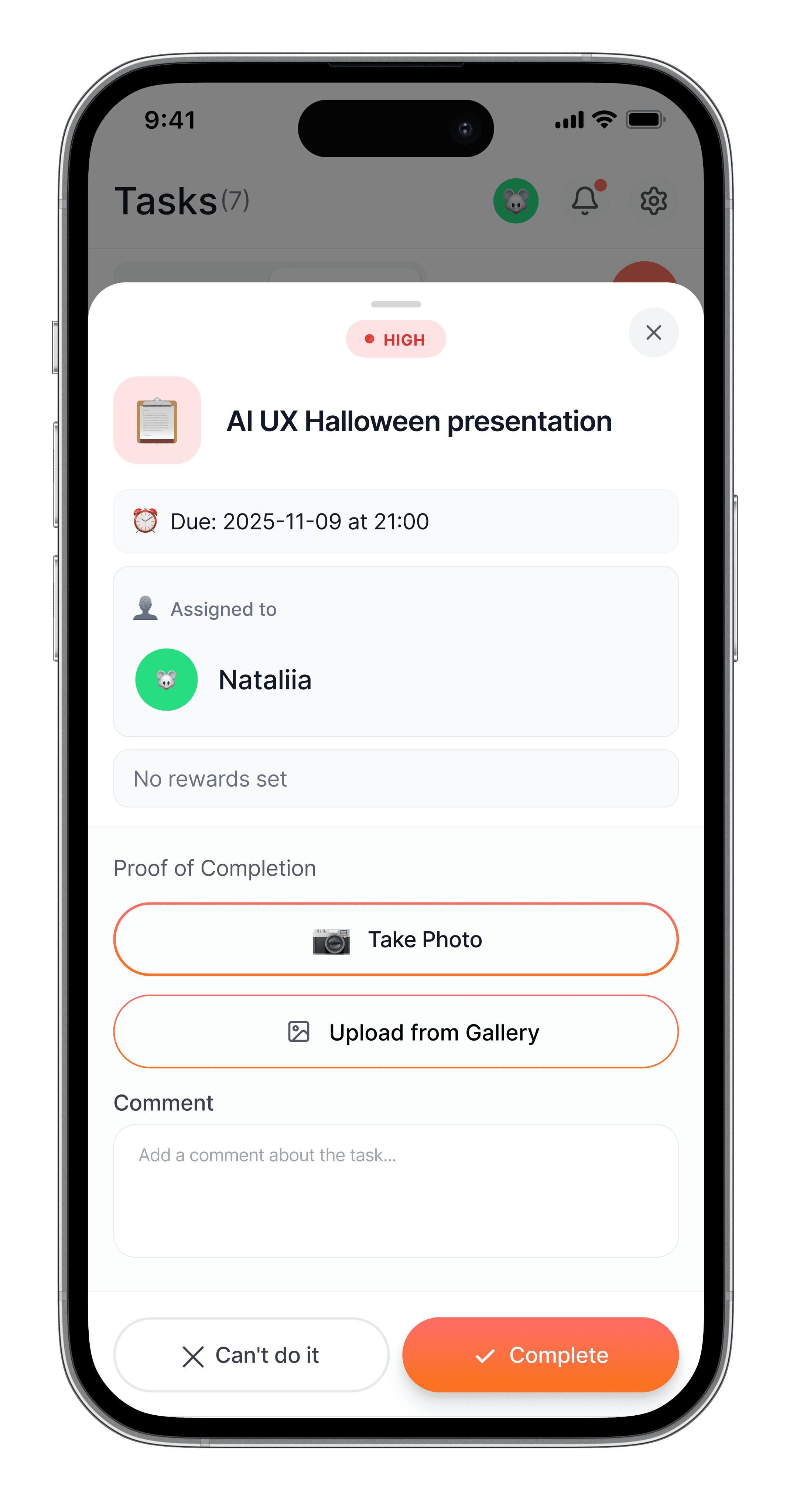
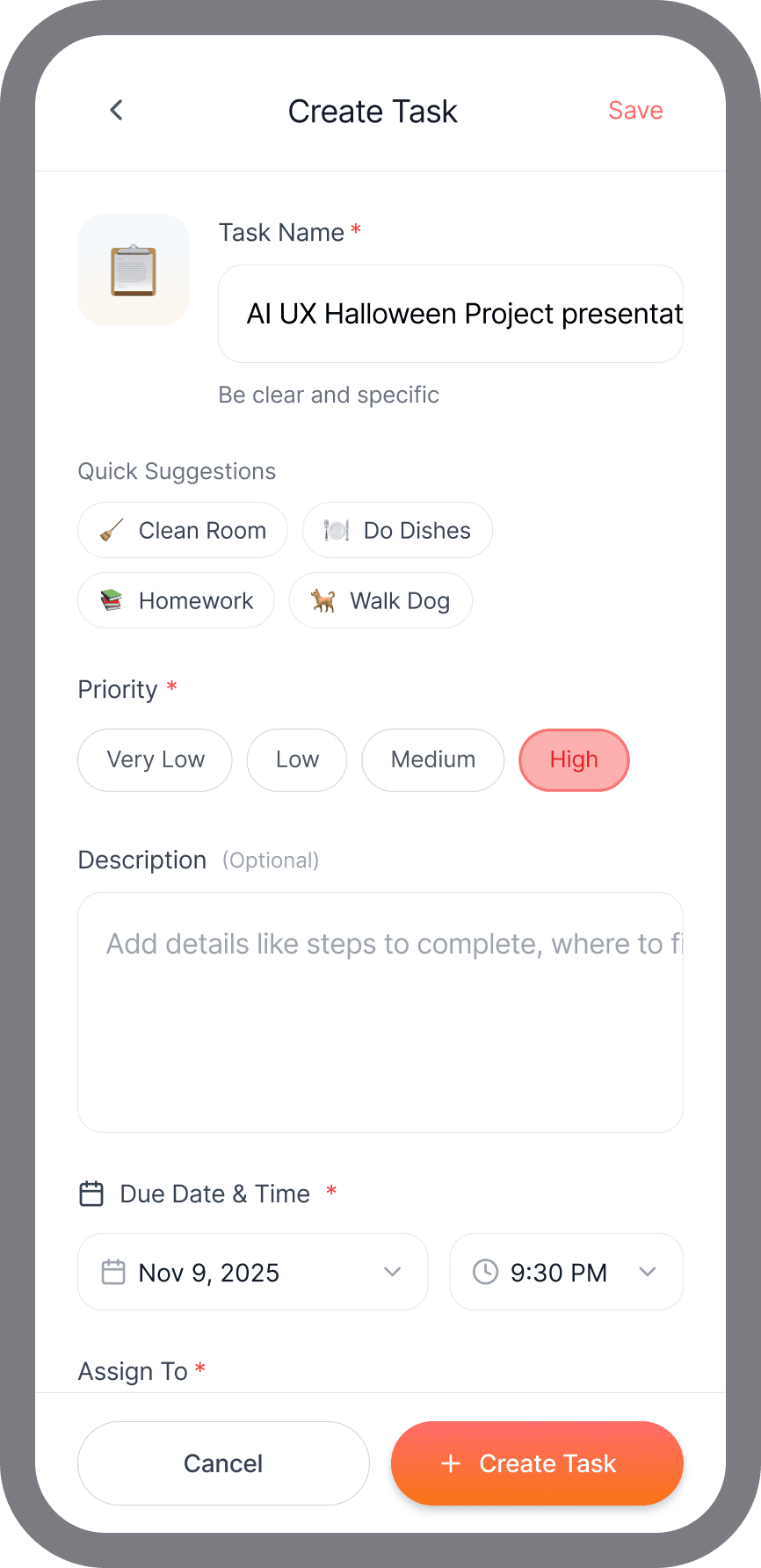
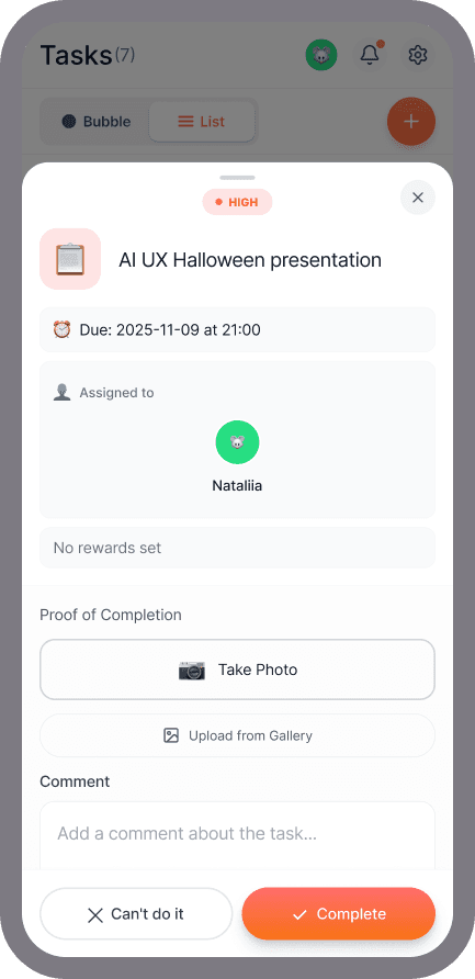
Before writing a single prompt, I sketched the core screens by hand - bubble view vs list view, task creation form, onboarding flow. The "Request photo" toggle and the question "Rewards - do I need it?" both came from this session. Sketching forced decisions that no amount of prompting would have surfaced.
Outcomes
A working prototype in 3 days. Something I actually use.
The bubble view solved the problem I built it for — tasks that live in the mental load zone between urgent and someday finally had somewhere to go that didn't feel like a second job.
Testing with 5 people surfaced one clear signal: 2 out of 5 wanted a shared bubble view for the whole family, not just individual task lists. Not just a Kanban board — the actual visual metaphor, shared. That's a meaningful enough pattern to take seriously. It's on the roadmap.
What the prototype proved: the size-as-urgency metaphor works without explanation. Nobody needed to be told what a bigger bubble meant. That's the only kind of validation that matters at this stage.
AI in my workflow
What went wrong - and what I learned about AI
Halfway through Day 3, Claude started drifting. Inconsistent components. Style shifts between screens. Logic that contradicted decisions we'd made two hours earlier.
The fix: I asked Claude to write out a full style guide first. Then I gave it a constraint prompt that referenced that guide every time. Immediately: focused, consistent, short responses.
Figma Make had a different problem. Halfway through, it started generating its own styles - new colours, new spacing, new component patterns that didn't exist before. And fixing one thing broke three others. Every correction created a new inconsistency somewhere else.
The fix wasn't elegant: I had to freeze the style guide, make changes in strict isolation, and test each fix before touching anything else. Treat vibe-coded output like a fragile system, not a draft you can freely edit.
The big lesson: You have to teach AI how to communicate with you. Clear constraints aren't limitations - they're what make the output usable. Rules are freedom.
A second thing: AI will do what you ask, not what you mean. The photo proof feature — where kids submit a photo before points are awarded - was my idea, not Claude's. It came from a real parenting instinct. Claude could build it. Only I knew we needed it.
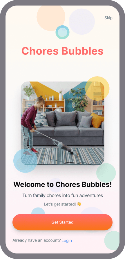
Try it yourself — clickable prototype
The app - fully interactive. Tap through onboarding, set up your family, create a task, explore bubble and list views. Built in Figma Make in one day from prompts and vibe code. No Figma account needed.
Reflection
What I learned
1. AI is amazing and frustrating at the same time. It needs active management. The moment you stop directing it, it starts making decisions you didn't ask for. You're never off the hook.
2. Constraints are a design tool, not a workaround. Writing a style guide for Claude - the same thing I'd do for a junior designer - made everything faster and more consistent. Treat the prompt like a brief.
3. The best features come from lived experience, not brainstorming. Photo proof wasn't in any framework. It came from being a parent who knows what "I did it" actually means in a house with a 13-year-old.
4. This is bigger than chores. The bubble system works for anyone carrying tasks without clear deadlines - roommates, solo adults, small teams. What started as a family app is really a mental load visualiser for anyone who's ever said "I'll do it later" and meant it.
Explore more…
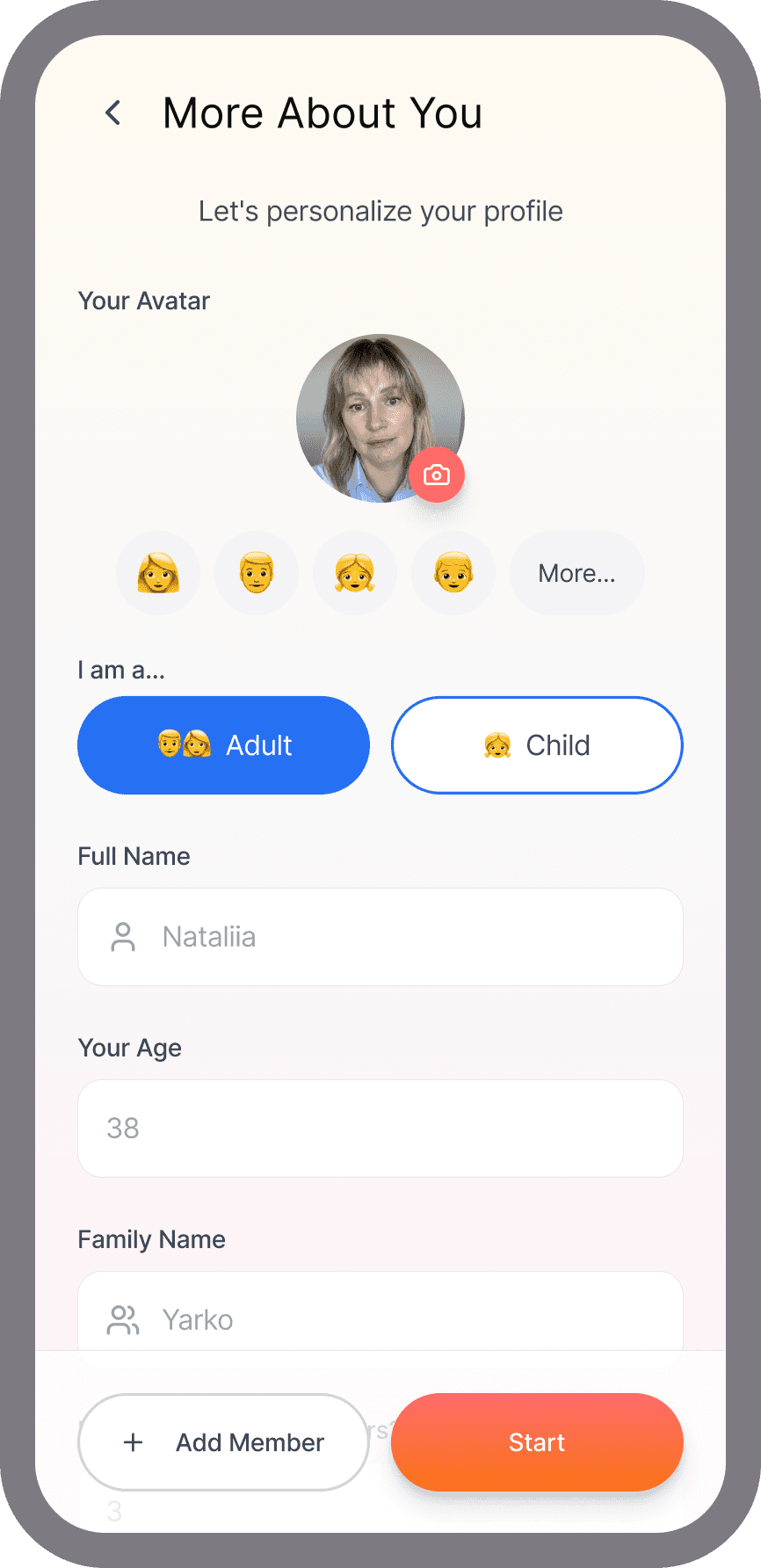


The complete set - from welcome screen to profile. Onboarding, family setup, task creation with photo proof toggle, bubble view, list view, task detail, rewards store, and profile. Every screen prompted and built in Figma Make.
What's Next — Taking It Further
The 3-day sprint proved the concept. Now I want to build it for real.
I tested the app with friends and family - the same people who recognised the problem in the first place. They found it useful. They also found bugs. UX issues I hadn't caught, development inconsistencies from the vibe coding process, components that broke in ways I couldn't easily fix without rebuilding.
So that's the plan. The concept is validated. The execution needs a cleaner foundation. I'm rebuilding it with a different tool - same idea, better UX, better code, fewer surprises.
I'm currently in discovery - evaluating tools and stacks (Cursor, Claude Code, Lovable, Expo) to find the right fit for how I want to develop this. The goal isn't speed this time. It's finding the approach that lets me stay close to the design decisions as the code grows.
I'll be updating this case study as I go.
If you've built something similar or have thoughts on the stack, I'd love to hear from you - connect on LinkedIn.


