Enter password to view case study
Full redesign
Real Estate Tech
Property Intelligence Platform

Context
N!mbus was losing customers after demos. Sales could sell the product, but users couldn't navigate it independently — leading to post-demo drop-off, high churn risk, and growing support costs.
I led a full redesign: rebuilt the information architecture, established a design system from scratch, and improved accessibility (WCAG 2.1 AA).
Before:
Users needed 3-4 sales calls to understand basic filtering
After:
New users filtering properties in first session without support
Before
N!mbus had 5,000+ paying users—but 63% had never discovered its most valuable feature
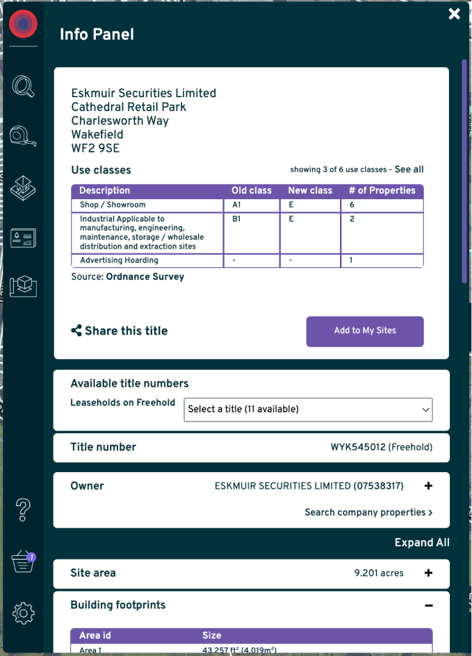
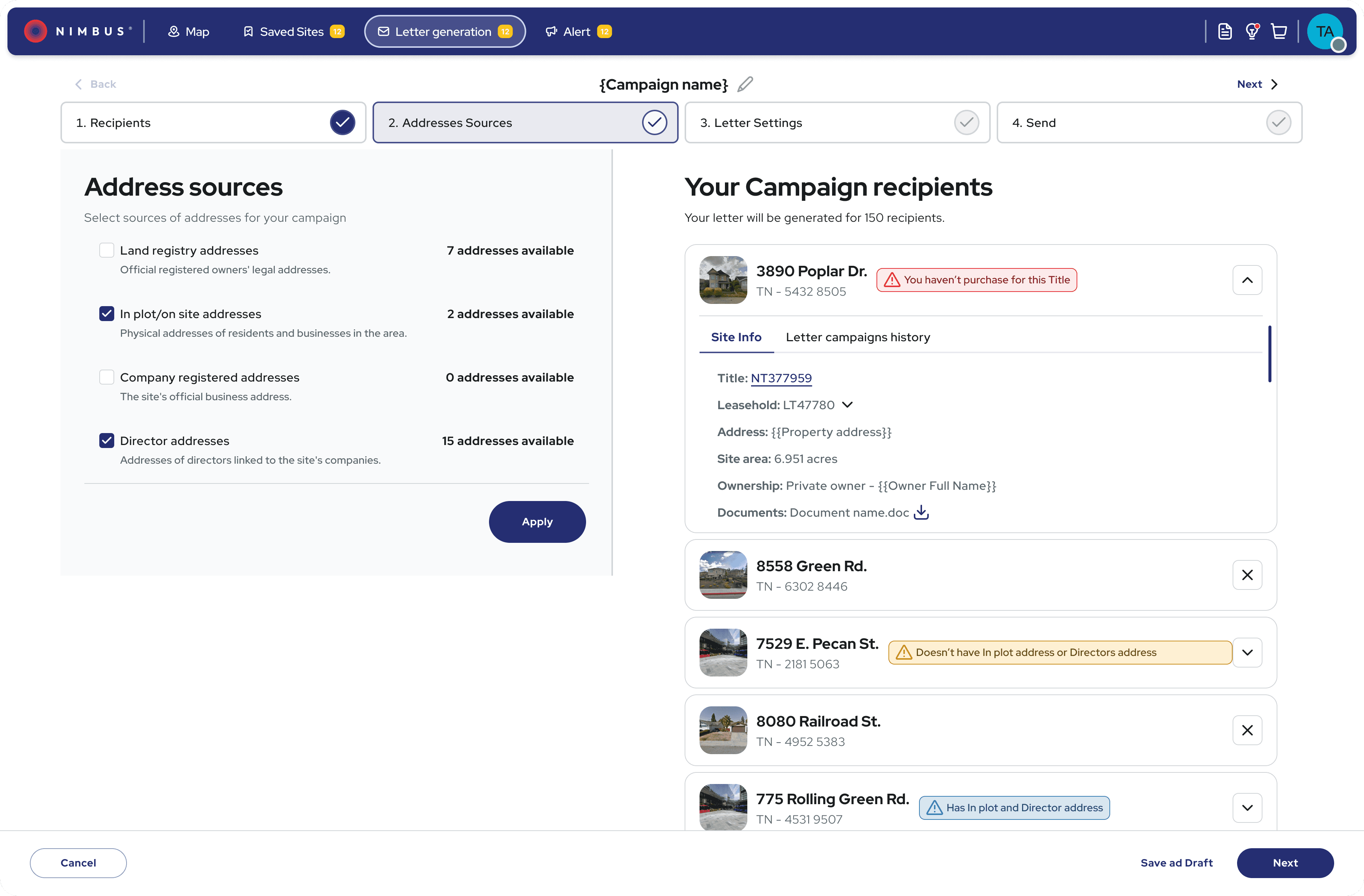
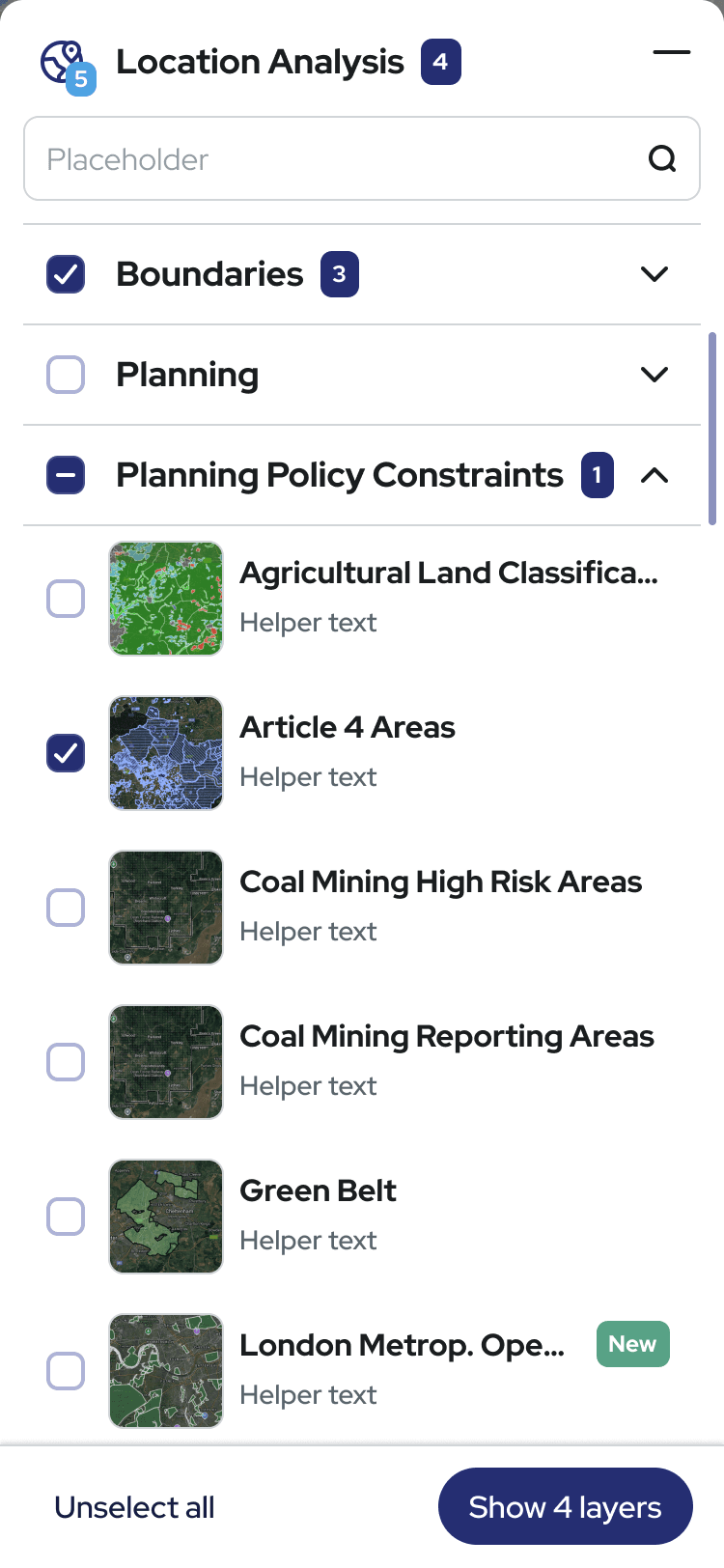
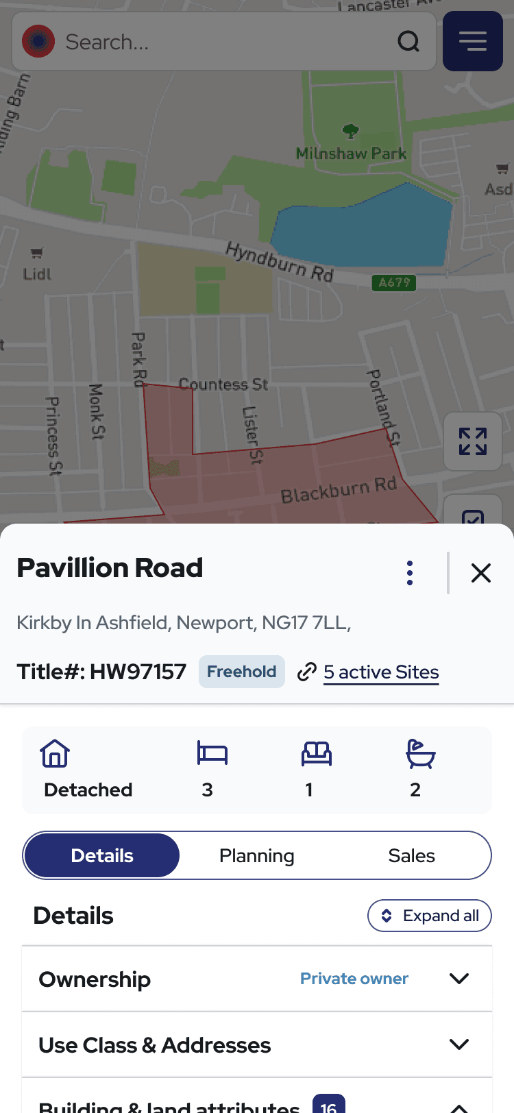
While sales demos worked, users struggled alone. They couldn't find location analysis even after months of use, filters were buried behind popovers with no visibility of what was applied, and the site info panel required multiple clicks just to see basic property data. Without clear navigation or trust signals, users abandoned the platform or defaulted to spreadsheets to validate decisions. In a high-stakes property market, this hesitation meant lost deals and churn.
The starting point: what users were working around
Almost every user started with the same question: 'where do I start?'" • Data-heavy panels without visual hierarchy • Map layers buried in nested menus • No clear entry point for new users


Constraints
Why redesigning this was risky
The risk
N!mbus was already making money. It had 5,000 paying users. Which meant every design decision could cost us revenue. Change too much, existing users churn. Change too little, new users bounce. And I had to figure this out with limited formal research - so I designed around behavioural signals and support ticket patterns instead.
The timeline
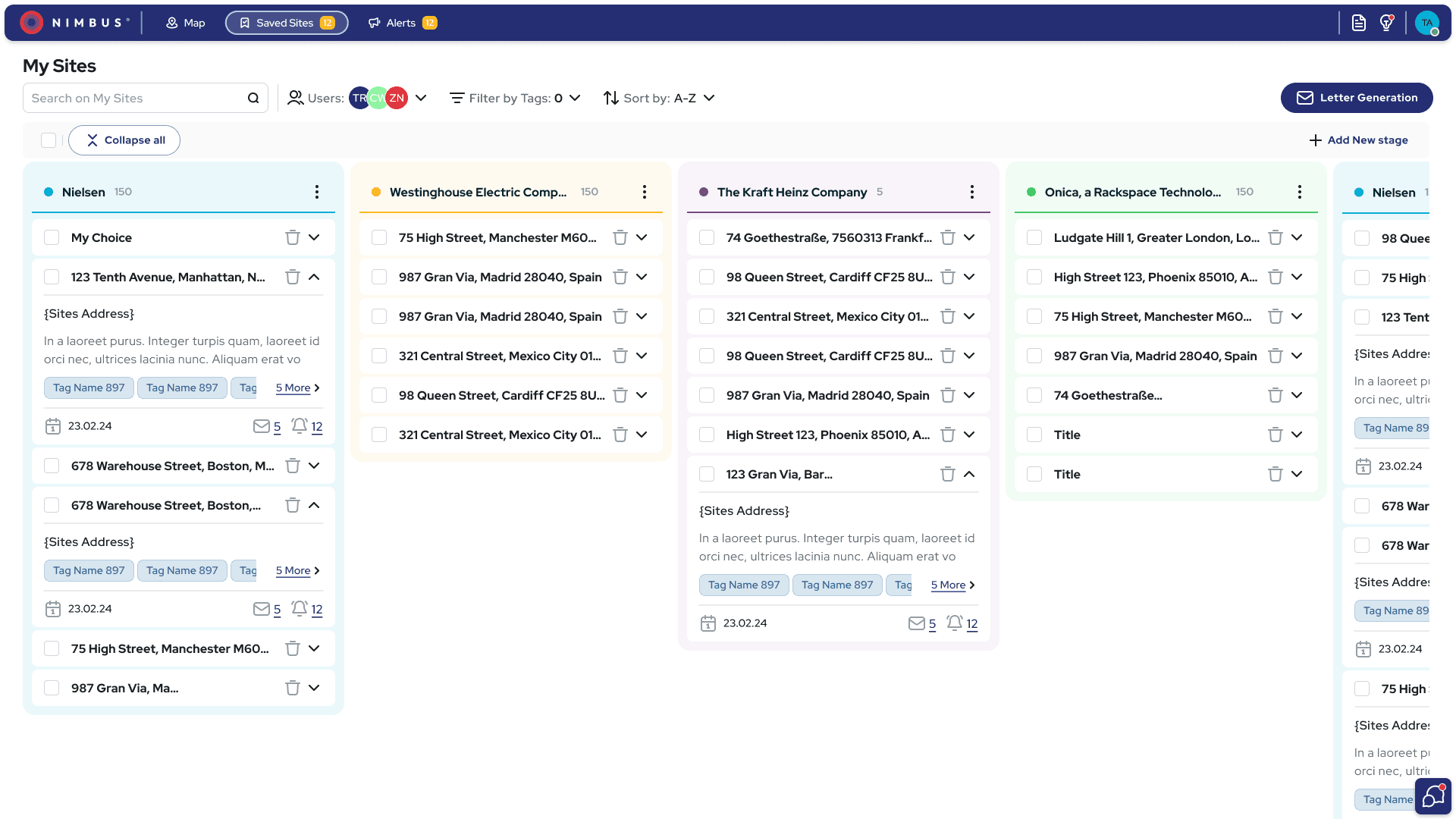
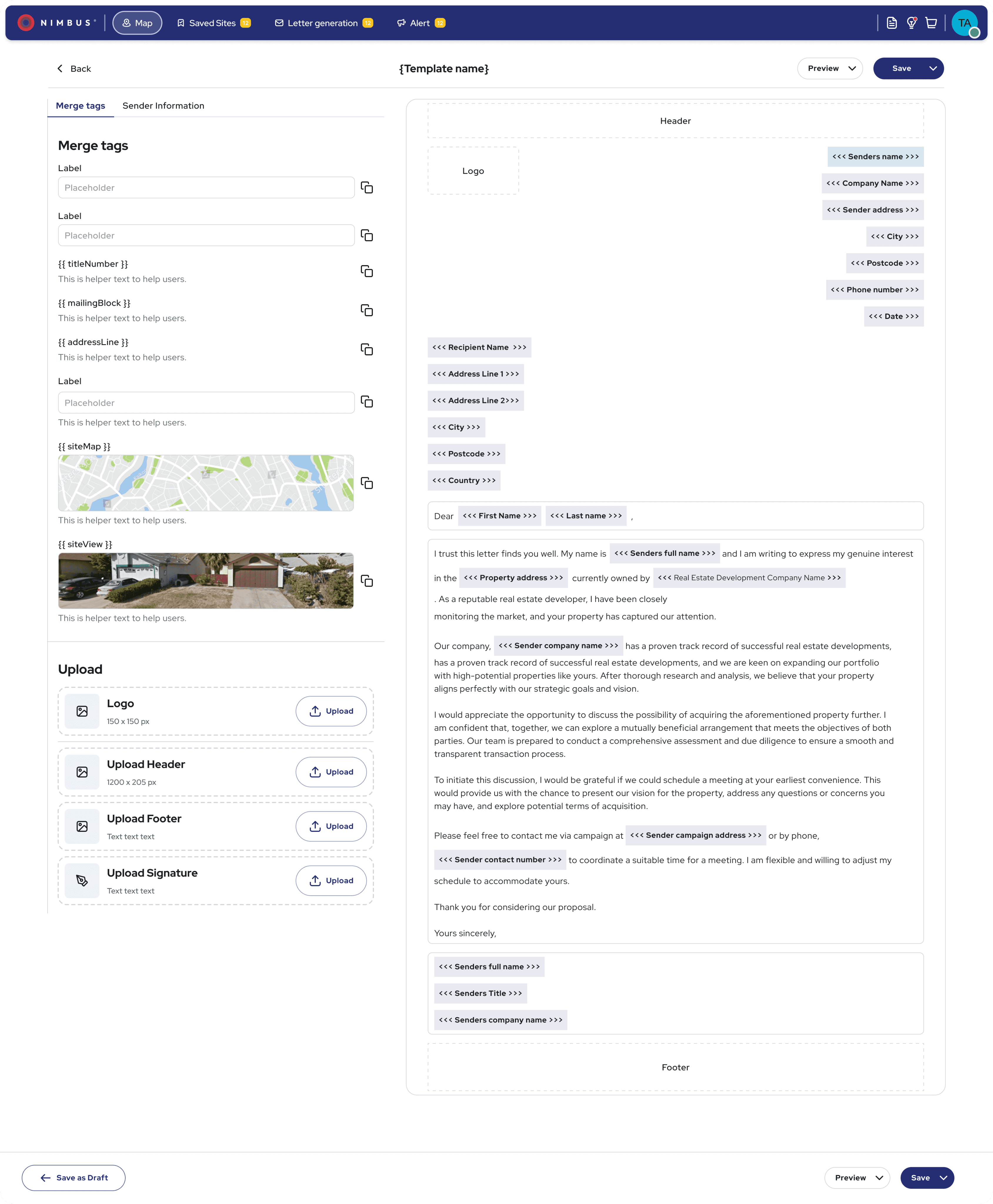
The initial redesign took 8-10 months - design system from scratch, filters, location analysis, saved sites, info panel. Then ongoing evolution for 2.5 years: comparables, letter generation, expanded layers. And throughout all of it, I maintained the legacy system in parallel. Every new feature needed to work in both systems until we could fully migrate.
The stakeholder tension
Engineering wanted to ship incrementally. Sales wanted everything at once. I couldn't give both what they wanted, so I built high-fidelity prototypes — sales could demo while engineering worked at their own pace. The sales director credits this as a factor in the 56% ARPU increase that followed.
Research
How I researched
12 usability sessions, 12 user interviews over 6 weeks. I also analysed 3 months of Microsoft Clarity recordings and categorised 200+ support tickets by topic. The gap between what users said in interviews and what they actually contacted support about — that was the most honest signal I had


• Three clusters emerged: navigation confusion, data trust gaps, and feature invisibility. The third one surprised us.
• Microsoft Clarity data showed 63% of users had never discovered the most valuable feature. Rage clicks concentrated on the filter popover. Average session depth dropped 60% after the first filter interaction.
Insights
The moment the problem reframed itself
Confidence - not features - was blocking decision-making
Across interviews, usability sessions, and behavioral data, one pattern emerged: users hesitated because they didn't trust what they were seeing. They needed to understand what they were looking at, why it is important, and whether it was safe to act on - without a sales call.
“I didn’t realise map layers (Location analysis) were included - even after a year of using the product.”
Existing user
“I wasn’t sure whether it missing data - or if the system was still loading.”
Existing user
“I needed clearer signals to understand what each action would actually do.”
Existing user
Designing clarity in a moving system
With shifting requirements and competing priorities. I couldn't wait for perfect research, so I prototyped fast and tested rough. Quick usability sessions. Clear choices about what to sacrifice.As the redesign progressed, I established a design system to prevent new complexity.
Ideation
Three filter approaches I tested - and why two failed
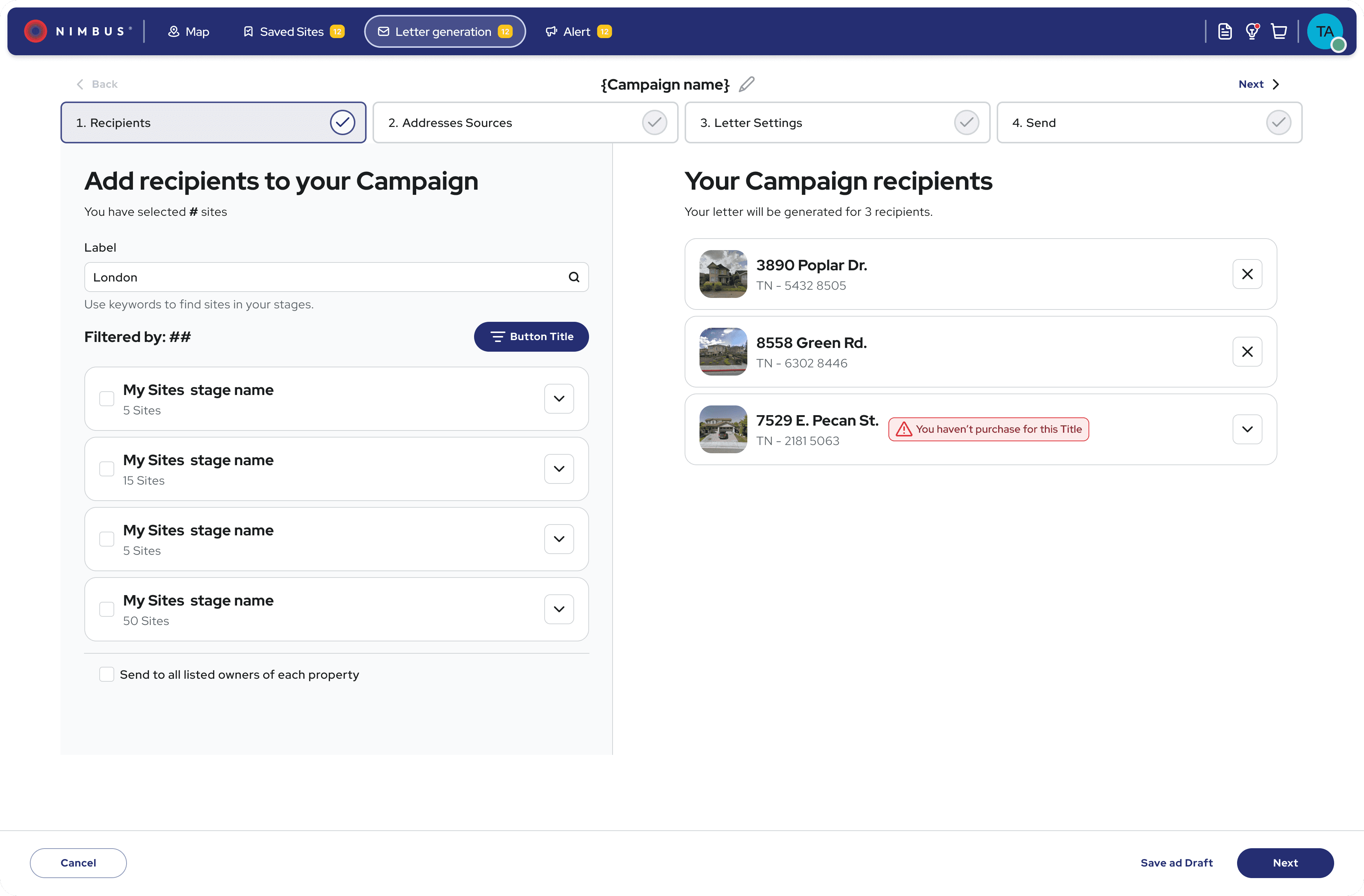
Organising 40+ filters without overwhelming users required testing multiple approaches. I explored how different patterns affected the speed and confidence of property searches.
Three iterations, six users, ten days - progressive disclosure won (v3). Version 2 failed because people couldn't pick a role.
"I'm both a surveyor and an investor, which tab do I use?"
— Existing customer
They spent more time deciding than filtering.
All filters visible
All filters expanded by default. Every option immediately accessible.
❌ Users overwhelmed by 40+ options
❌ Couldn't distinguish basic from advanced
❌ Abandoned before filtering
Role-based tabs
Filters organised by user role (Developer | Surveyor | Investor).
❌ Users didn't identify with role labels
❌ "I'm both a developer AND surveyor—which tab?"
❌ Created barriers instead of clarity
Progressive disclosure
Collapsible categories + keyword search + background processing.
✅ Users started filtering immediately
✅ Search revealed advanced options when needed
✅ Favourites for frequently used filters
Design
Designing clarity in a moving system
Built from scratch, still running two years later
100+ components
AI prompt layer
No shared foundation meant every handoff was a negotiation. I built one: 100+ components across colour tokens, typography, spacing, icons, modals and forms - documented in Figma and Zeroheight.
Before the system, every developer handoff started with questions about spacing and colour. After, they didn't. When the team moved to AI-assisted coding, I wrote style prompts for Cursor, Copilot, and Roo Code separately — each tool generates slightly different output. The prompts kept vibe-coded output consistent with our token system. No remediation rounds.
Two years on, the team still uses it.
Built accessibility into the foundation from day one - all components met WCAG 2.1 AA from the start, which meant zero remediation work later.
Designing for how users actually think, not how the product was built
Designing for real decision - making
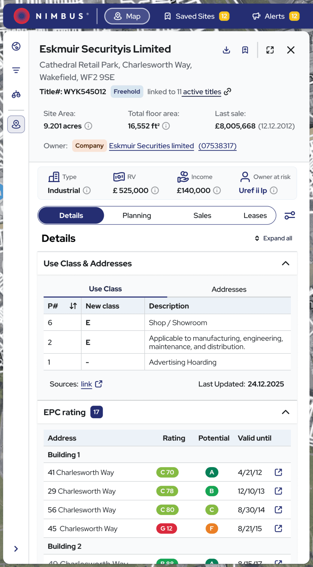
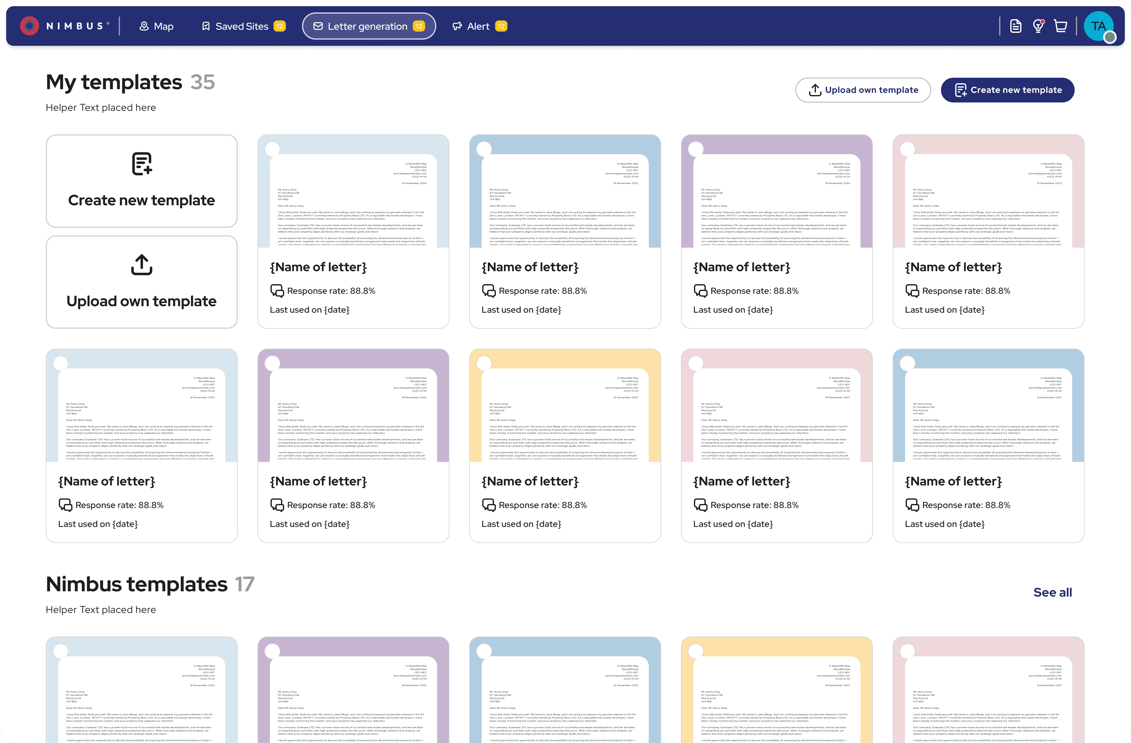
N!mbus had grown feature by feature. I mapped the real decision journey users followed - scanning, building confidence, validating constraints, taking action.
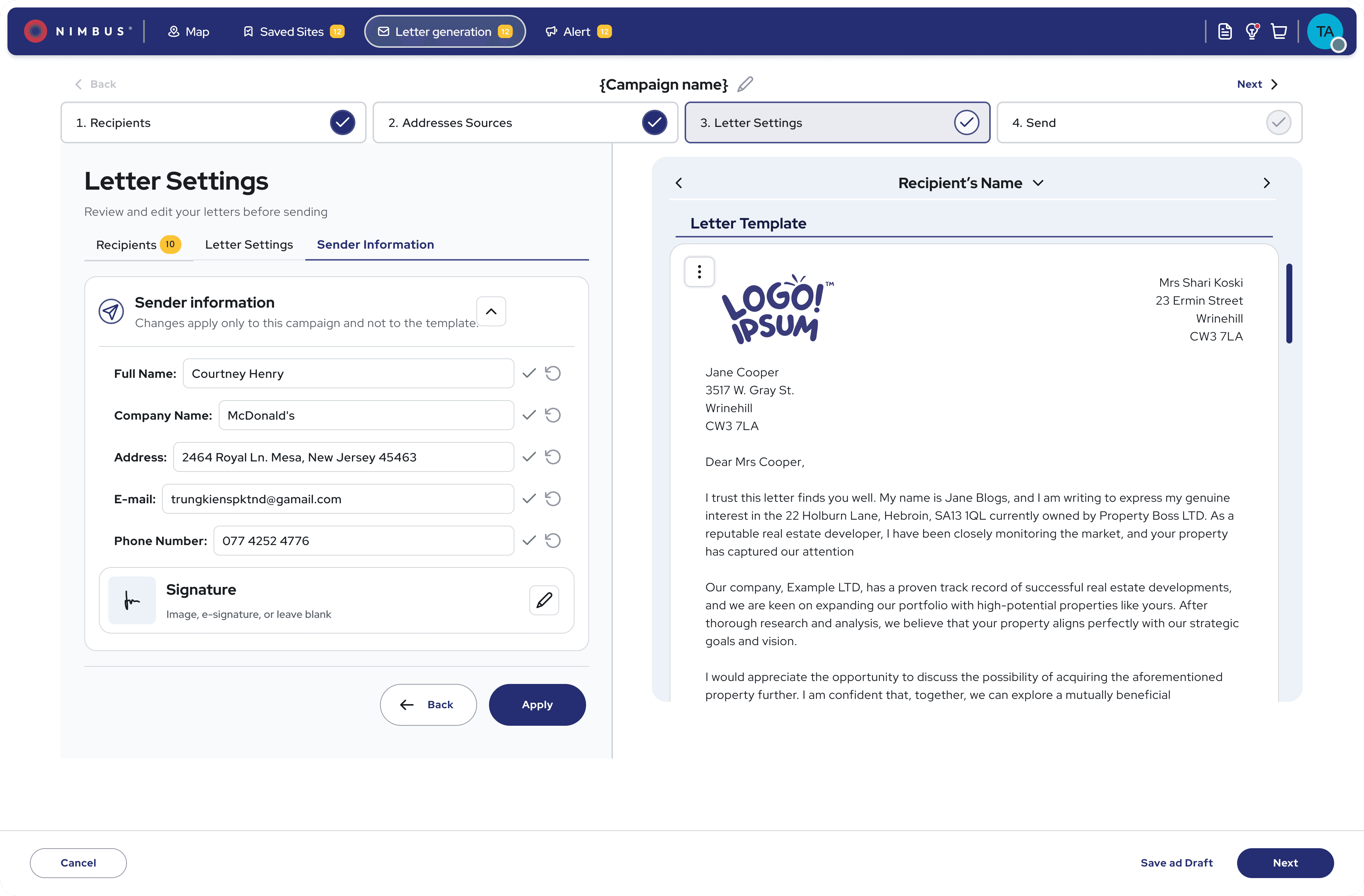
Users included developers, surveyors, investors, and planners with different goals. I focused on patterns: progressive disclosure, site cards for quick scans and deep dives, mobile views for on-site decisions. This reduced cognitive load without sacrificing depth or speed.
The final design
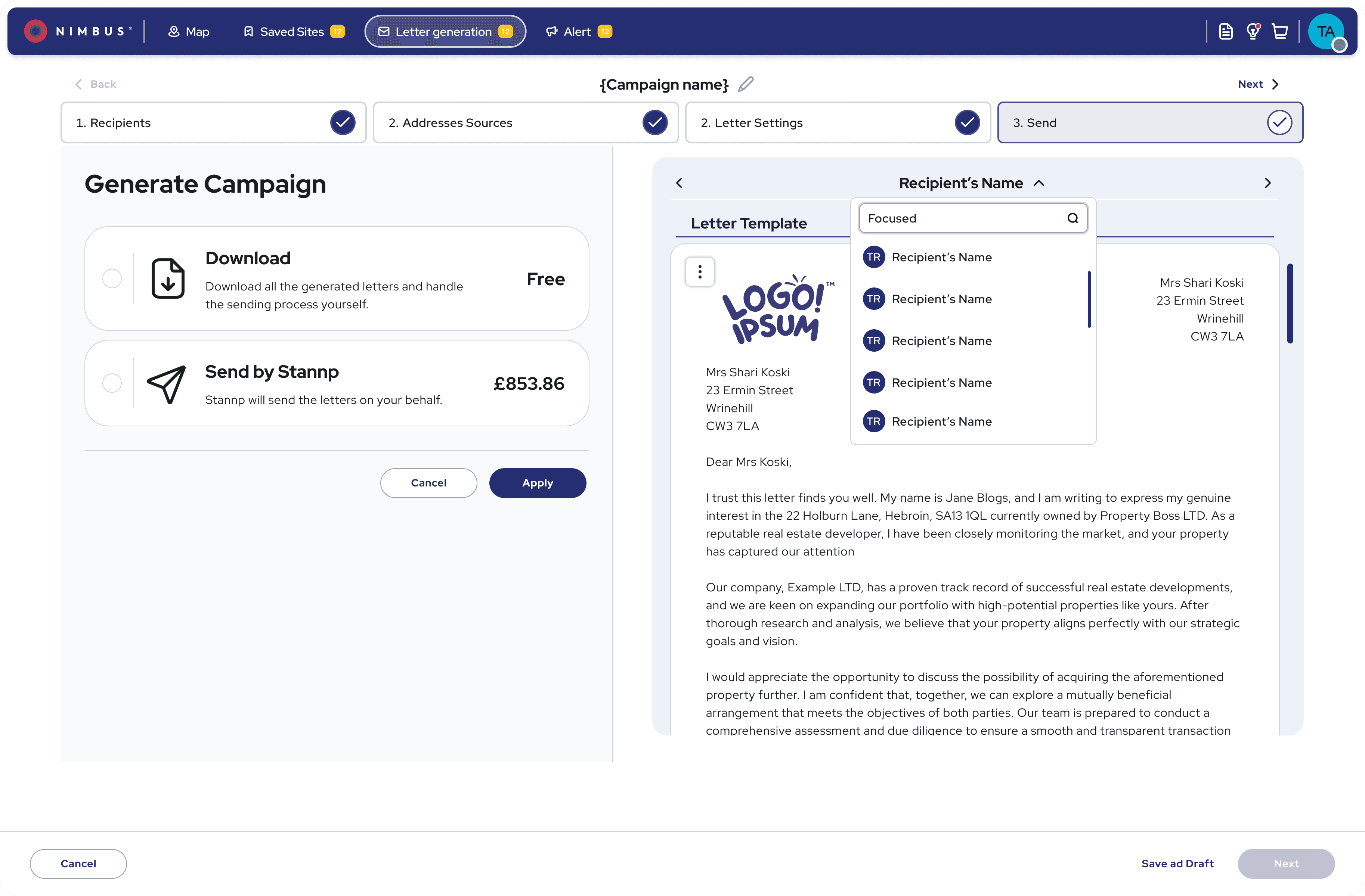
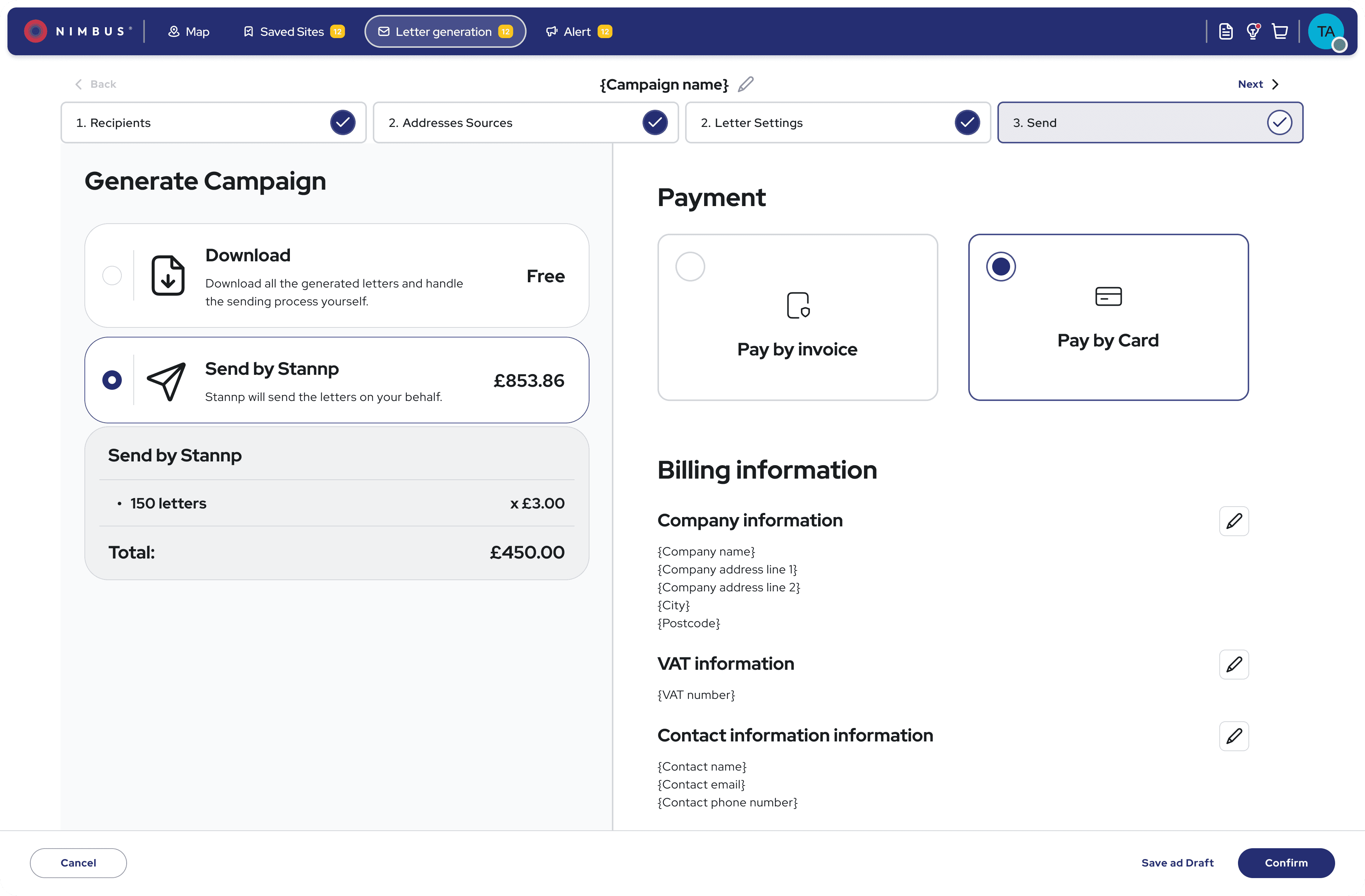
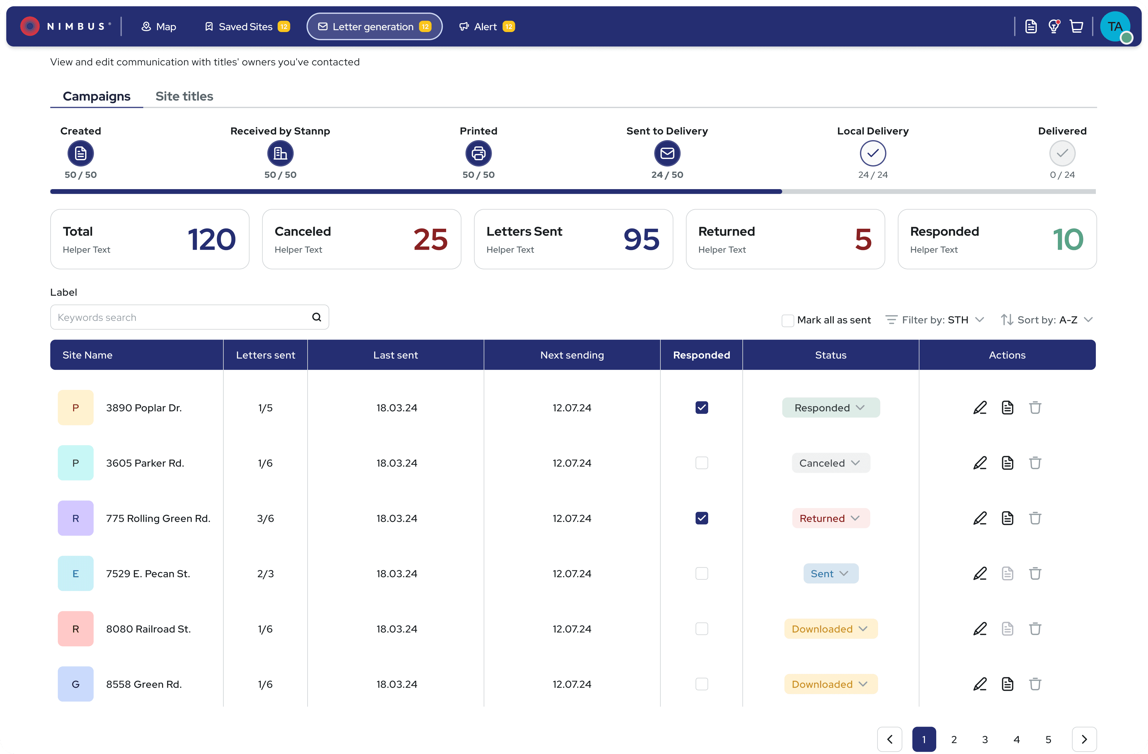
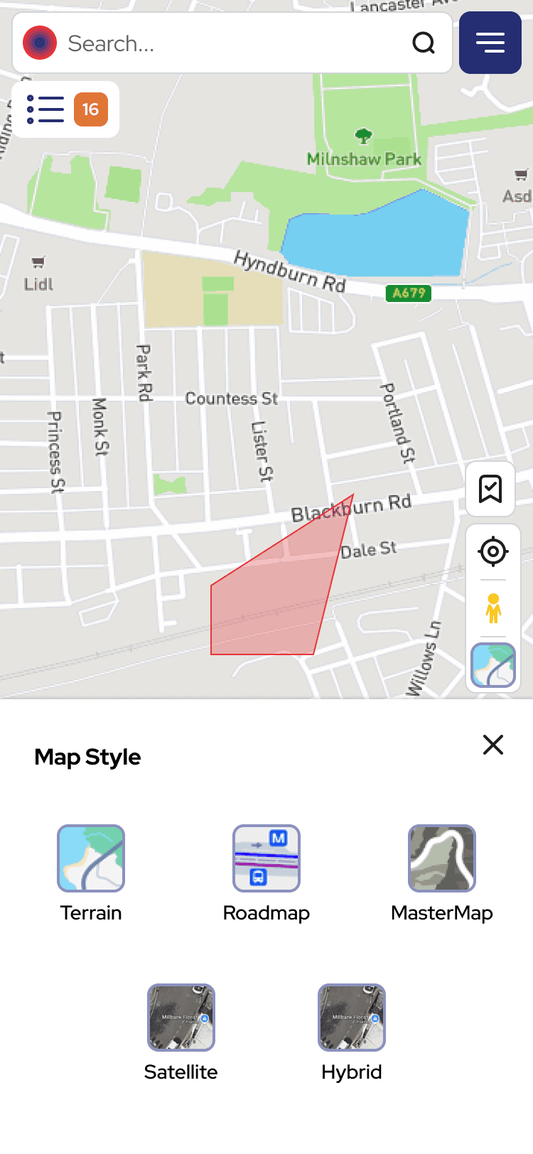
Comprehensive property data accessible on-site via mobile or during desk research on desktop. Designed for quick scanning and deep analysis depending on user context.

Validation
Launch: phased rollout with an opt-out
Would 5,000+ users accept the change?
Redesigning a live product with paying customers meant every change carried risk. We rolled out the new filters first to measure impact.
The result: Support tickets dropped 36% in the first two months. A year later, that reduction held—users kept finding what they needed without asking for help.
The prototype that enabled sales conversations
Sales used this clickable prototype to demo the new filter experience before development. Prospects wanted to buy what they saw - driving the 56% ARPU increase.
After
A product users could navigate and trust on their own
Two major improvements shipped while broader evolution continued. Sales leveraged detailed prototypes to close deals on future capabilities, generating revenue before launch. Capabilities became discoverable and trustworthy, with users relying less on sales walkthroughs
Outcomes
From sales dependency to product-led growth
High-fidelity prototypes became a sales tool before launch - prospects could visualise the value and commit to future capabilities, generating revenue before a single line of code shipped.
Within one year (FY2024 → FY2025):
~2× ARR growth
+56% average contract value
33% reduction in user friction, 25% increase in usability satisfaction, 3× growth in advanced feature adoption
36% reduction in support tickets in the first 2 months - and that reduction held a year later, freeing ~40% of sales capacity for expansion vs. onboarding
"The new interface finally makes sense - I found features I didn't know existed that are saving me hours every week."
— Surveyor, existing customer
"For the first time, I didn't need to call support during my trial."
— Residential Developer,
new customer
"We can finally upsell advanced packages because customers can actually use them."
— Sales Director


Reflection
What I'd do differently
The map layer keyword search was the first time we surfaced content the user didn't know to look for. It worked. But it raised a question I'm still sitting with: [question].
I'd push for structured research earlier. I had behavioral data and support tickets, but I was piecing together mental models from fragments. Dedicated discovery sessions in month one would have shortened the decision loop — we tested three filter patterns when two might have been enough.
The persona work didn't survive contact with real users. People moved between roles depending on the day and the deal. Giving them control over the interface worked better than predicting what each "type" needed. I'd skip the segmentation exercise next time.
The prototype-as-sales-tool was accidental. It worked well enough that I'd make it deliberate from the start.
The question I'm still sitting with: how do you design for AI-assisted discovery without removing the sense of control that made users trust the system in the first place?


