01 — Business context
The Platform & The Tension
The Platform
UK PropTech platform with ~9,000+ paying accounts, used by developers, investors, planning consultants and land buyers to evaluate sites, planning constraints and development opportunities.
Over five years, the platform grew feature by feature. As capabilities expanded, discoverability declined, onboarding remained sales-led, and users increasingly relied on Support.
The Tension
The platform had plenty of capability, but the experience wasn't keeping up with its growth.
Discoverability was declining, key workflows were increasingly complex, accessibility requirements weren't being met, and users relied on Support to navigate the product.
The challenge was to make the platform easier and more inclusive to use without reducing the depth professional users needed.
Success meant
More discoverable functionality
More accessible workflows
Less dependency on Support
A scalable foundation for continued growth
If nothing changed, the cost curve would keep going the wrong way.
Every new feature would add to Support load instead of paying for itself. The platform would grow more capable and harder to use at the same time.
Five years of growth created a powerful platform, but not an understandable one.


02 — Problem
The real problem was deeper than onboarding
The business problem
Valuable functionality sat unused while support load climbed with every new feature. Growth was starting to cost more than it returned.
The user problem
Users weren't blocked by missing features. They struggled to find, understand and trust the functionality already available to them.
What research proved wrong
A platform survey showed that 63% of users were unaware of valuable functionality. Release updates sent by email were often overlooked.
Further research pointed to a deeper issue: the product structure itself was making functionality difficult to discover and use.
The problem wasn't getting users into the product. It was helping them navigate, understand and act on its capabilities.
Discovery
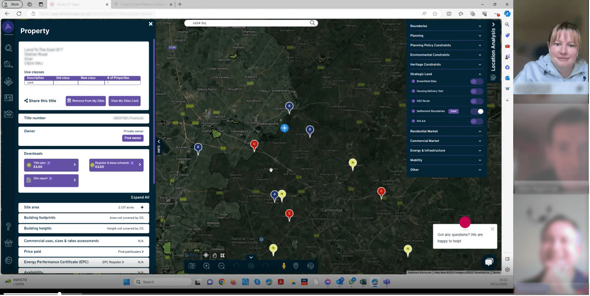
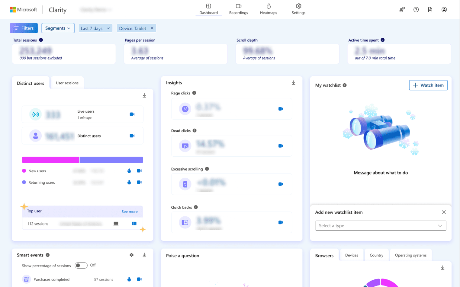
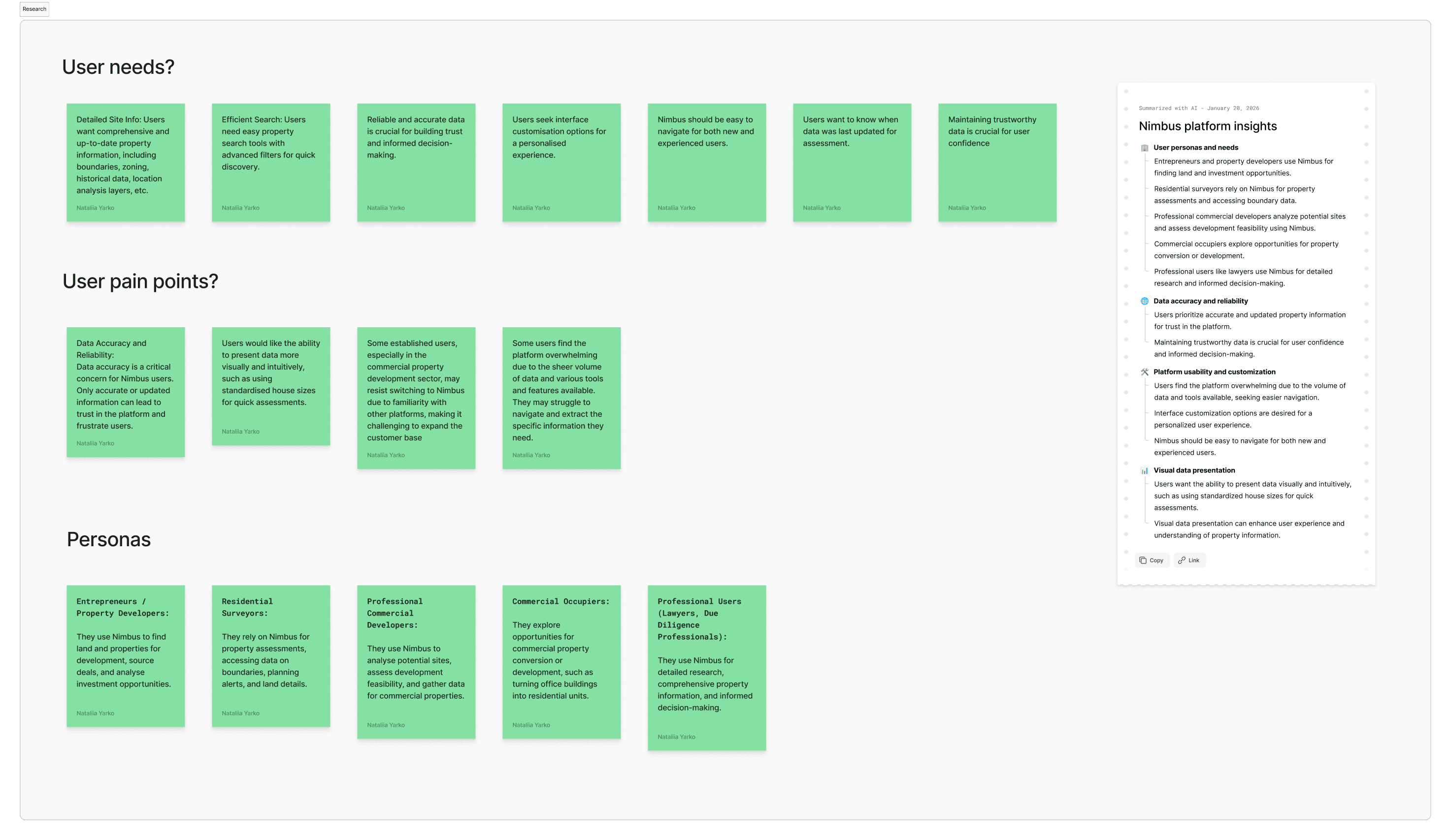
To understand why users struggled despite the platform's rich functionality, I combined customer interviews, behavioural analytics, Microsoft Clarity and moderated usability testing.
Evidence from research and behavioural data
Navigation confusion: Users struggled to understand where functionality lived.
Feature invisibility: Valuable capabilities existed but weren't being discovered.
Data trust gaps: Missing context, including timestamps, reduced confidence in critical datasets and increased reliance on Support.

03 — My role
Sole Designer. End-to-end ownership.
As the sole Product Designer, I owned the UX across the platform — from research and problem framing through information architecture, interaction design, design systems and rollout.
What I owned
I led the work end to end — from customer research and problem framing through information architecture, interaction design, accessibility and design system development. I worked closely with Engineering and customer-facing teams to validate ideas and ship the redesign incrementally alongside new functionality.
From feature delivery to platform redesign
I was hired to ship features. Research showed that the bigger constraint wasn't missing functionality — it was how the existing product was structured and exposed.
I built a case for shifting from feature delivery to a broader platform redesign, backed by the research findings. It took weeks to get buy-in, the initial ask was for more features, not a structural rework. Once approved, it became a multi-year transformation.
From that point, redesign and new feature development ran in parallel, so the product could evolve without blocking delivery.
Timeline
2023 - Present
First 2 weeks: Learning the platform as a user, not a designer.
Months 1–2: Research - sessions, Clarity data, stakeholder interviews. Hired to ship features, research showed the problem ran deeper.
Month 3: Presented research findings and made the case for redesign. Initial pushback, stakeholders wanted features, not discovery. Got approval.
Month 4+: First IA redesign presentation reframed the whole direction. Founders got involved. Scope expanded.
Since then: shipping incrementally - redesign and new features in parallel, never blocking development.
04 — Direction
From feature groupings to decision-making.
Research showed that the challenge wasn't a lack of functionality, but how the platform organised and exposed it. I focused the redesign on five moves: making the product easier to navigate, improving discoverability, reducing cognitive load, enabling self-service and helping users act with confidence.
1.
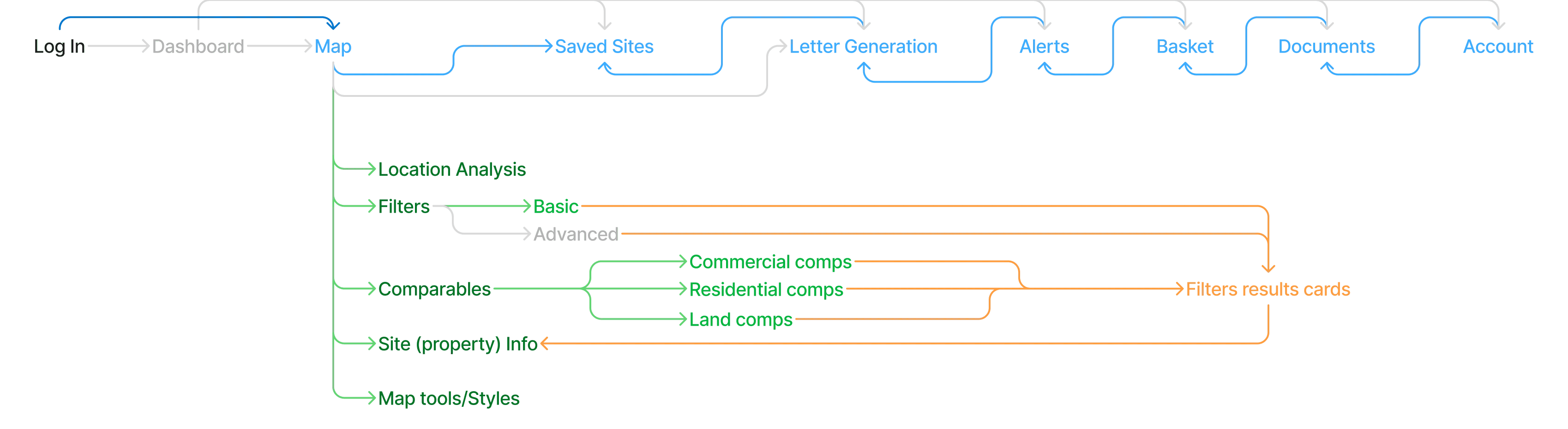
Rebuild information architecture
Organise around workflows, not historic feature groupings.
2.
Make functionality discoverable
Surface hidden capabilities without requiring Support intervention.
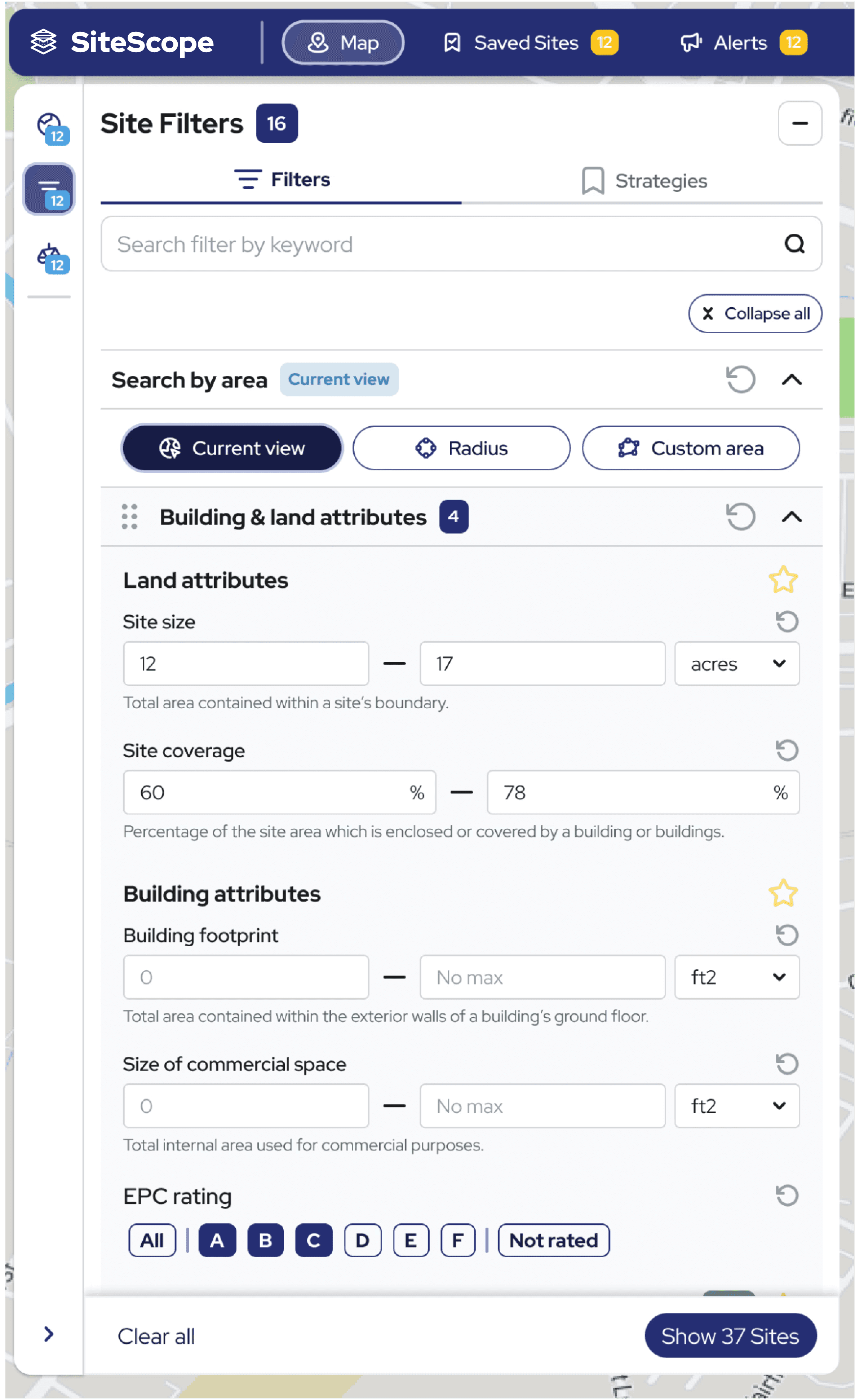
Filters moved from a hidden popover to a persistent panel with keyword search.

Designing the filtering experience
The redesign grew filters from 25 to 80+. Showing all of them at once overwhelmed users.
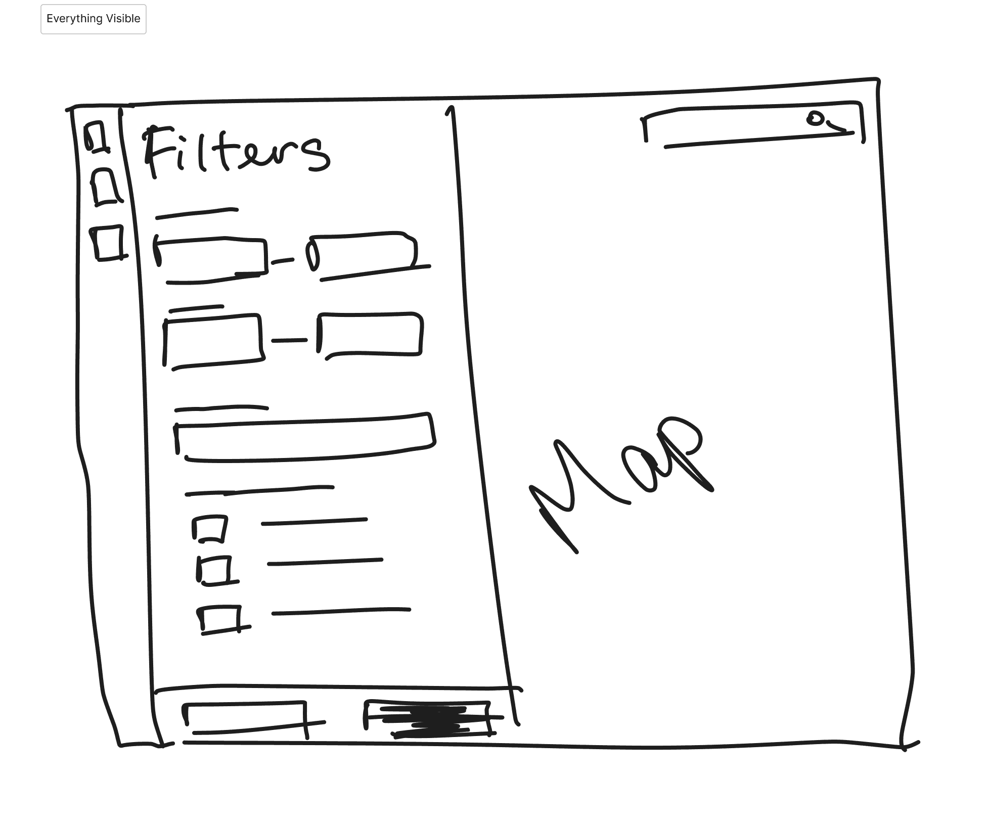
All filters visible: every option immediately accessible.
❌ Users overwhelmed by 80+ options
❌ Couldn't distinguish basic from advanced
❌ Abandoned before filtering
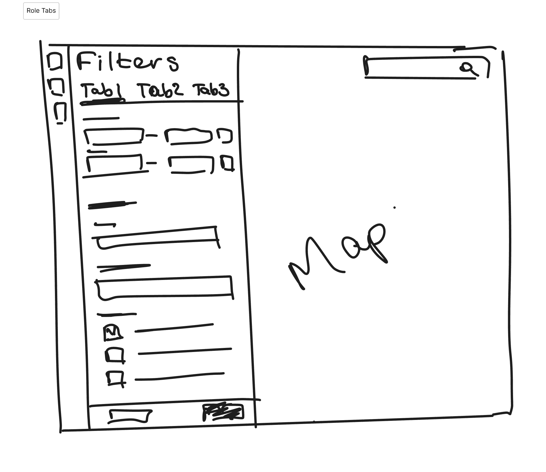
Role-based tabs: filters organised by user role.
❌ Created barriers instead of clarity
❌ Users didn't identify with role labels
❌ "I'm both a developer and surveyor, which tab?"
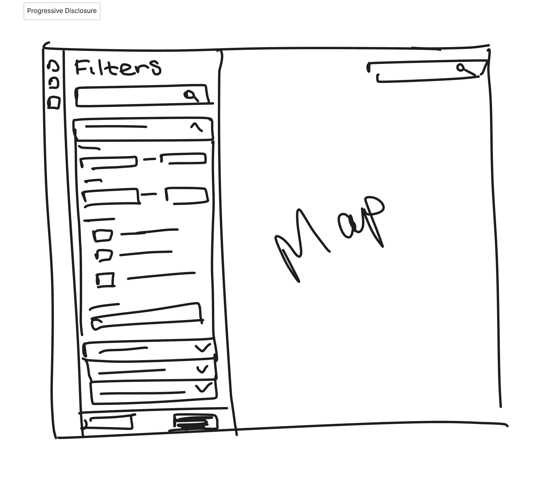
Progressive disclosure:
Collapsible categories + keyword search + background processing.
✅ Users started filtering immediately
✅ Search revealed advanced options when needed
✅ Favourites for frequently used filters
3.
Cut cognitive load
Make complexity easier to scan and understand without reducing capability.
74 title numbers with no context → scannable lease summary with occupancy, rent, and expiry at a glance.


4.
Give users a way in without Sales or Support
The self-serve path replaced a Zoom-only onboarding call as the default path.

5.
Guide intent before acting
Alongside the filters, an AI search lets users describe what they need in plain language, then confirms a summary before running it.

05 — Impact
The redesign changed more than the interface
The work improved how users discovered and completed tasks, reduced reliance on Support, and created a more scalable foundation for continued product development.
UX impact
Feature discovery time
* Measured through comparative moderated usability testing.
Task completion time
* Measured through comparative moderated usability testing.
System Usability Scale Score
* Comparative testing across new and existing users.
Customer Satisfaction Score
* Based on post-launch customer satisfaction survey (10/12 respondents rated positively).
Navigation efficiency
Improved navigation efficiency observed during usability testing.
Product impact
Support requests
after onboarding shipped
Design-to-dev time
after building a 950+ component design system
Comparables: from minor feature to сore workflow
Research revealed that the limitation wasn't discoverability alone—it was product capability. Our users evaluated sites using significantly more criteria than the product supported. What began as five comparison filters evolved into a scalable comparison workflow with 35+ filtering criteria in a single category, creating a framework that could later expand across multiple comparison areas.
Business & operational impact
Less dependency on Support
Key journeys became more self-service, reducing the need for human assistance.
Removed an onboarding bottleneck
Users could start using the product without first scheduling a Sales or Support call.
More scalable delivery
Reusable components, patterns and documentation gave the team a stronger foundation for extending the product.
Complexity without capability loss
The redesign made a growing feature set easier to navigate without stripping away the depth professional users needed.
Beyond the numbers: the redesign made the platform demonstrably easier to sell and to extend. It changed the internal conversation from "What feature do we add next?" to "How do we help users find value and decide with confidence?"
Post-launch feedback was consistent. Existing customers found capabilities they didn't know existed. New customers completed onboarding without a single support call during their trial. Support tickets shifted from navigation confusion to data questions, a sign the interface itself was no longer the problem.
06 - Approach & Rationale
How research shaped my design principles
Design Principles
Simplify without removing capability
Support decisions, not just data access
Recognition over recall
Accessibility first
Design for multiple valid workflows, not one ideal path
Discovery Insights
Stakeholder tension. I pushed for collapsible information panels to protect map visibility. Leadership wanted them permanently expanded for demos. The stakeholder version shipped first. Beta users then reported the exact visibility problem I'd flagged, and the panel was revised.
The data-trust thread. Key datasets had no timestamps. Users couldn't tell if information was current, so they didn't trust it, and called Support before acting. Adding timestamps increased user confidence as much as the interface improvements did.
Accessibility in practice: I validated accessibility through automated audits, keyboard navigation, screen-reader testing and 200% zoom. Issues were tracked and resolved before release.
Traditional personas proved insufficient for predicting behaviour in this product. Users with similar goals worked in different ways, leading me to prioritise flexible workflows over a single predefined journey.
These principles emerged from customer interviews, Microsoft Clarity, behavioural analytics and moderated usability testing conducted throughout discovery.
07 — Final Solution
Three workflows that became product anchors
Onboarding: from Zoom call to self-serve
The previous path was a scheduled call with a salesperson, which excluded anyone who couldn't do a live session. The self-serve onboarding experience replaced the demo as the default path.

Comparables: from minor feature to core workflow
Sales used the clickable prototype to demo the new filter experience before development finished. The redesign later contributed to 75%+ ARPA growth, alongside pricing and commercial changes.

Before:
Comparables was buried inside Location Analysis, a map-layers panel. Nobody looking to filter properties would think to check there.

After:
a dedicated Comparables tab with custom area search, property type and tenure filters, built for the task instead of hidden inside an unrelated feature.
Letter Generation: 0 to 1
Property sourcing depends on outreach to landowners, and users were doing it by hand outside the platform. Letter generation turned a manual job into a native workflow that kept users inside the product at the moment of action.


08 — Outcomes
Rollout learnings
User behaviour challenged our assumptions
Users organised information differently than any persona predicted, even when their goals matched. That confirmed the bet on flexible workflows over a single path.
The panel decision, revisited
During design, I recommended collapsible information panels to preserve map visibility. The stakeholder-led alternative shipped first. Beta feedback confirmed the visibility issue I'd flagged: the expanded panel covered 50% of the map, and at 125%+ zoom, the most common browser setting among our users, it took over the entire view. The interaction was revisited and the collapsible version shipped.
Where the new IA cost us
The new navigation confused a group of long-time power users in the first few weeks after rollout. They'd built muscle memory around the old feature groupings, and the workflow-based structure meant relearning where things lived. We added a temporary "where did this move" banner linking old locations to new ones. Support tickets on navigation dropped to near zero within six weeks, and the banner came out.

At 125%+ zoom, the most common setting among our users, the expanded panel took over 75% of view — the trade-off research had flagged.

Foundation before features
Rebuilding information architecture, navigation and the design system created a foundation that made future feature development faster and more consistent than continuing to extend the legacy experience.
Business Impact
How this redesign affected Business
75+%
ARPA growth
over 2 years
Contributed to ARPA growth alongside sales and pricing changes. Redesign made high-value workflows discoverable and easier to act on.
2×
ARR Growth
roughly doubled year-on-year.
Better discoverability and positioning fed directly into stronger sales conversations and retention, roughly doubling annual recurring revenue.
"We can finally upsell advanced packages because customers can actually use them."
— Sales Director
"The new interface finally makes sense - I found features I didn't know existed that are saving me hours every week."
— Surveyor, existing customer
"For the first time, I didn't need to call support during my trial."
— Residential Developer,
new customer
"The tickets we get now are almost always about missing data, not about people getting lost in the interface."
— Support Team
09 — Reflections
What this work actually was
Complex platforms are limited by confidence, not features
Users never asked for more. They asked to trust what was there enough to act. That reframe drove every real decision in the project.
What I'd do differently
I'd push for customisation much earlier: configurable property cards built around how each user actually works. Users trust what they've shaped themselves more than what's handed to them.
Driving product direction without formal ownership
This wasn't interface design. It was reframing the problem, aligning stakeholders around evidence, and moving the organisation toward better decisions without ever holding the authority to order any of it.